Tuesday, July 27, 2010

scrapbooking your faith -things I love

Sorry I've been such a slacker posting lately. It's been very busy here. Last week we took some vacation time even and I used a lot of the time to get caught up on cleaning in various parts of our house. You know you are busy when you don't have time to clean. :)
We did go somewhere too, but the days we stayed home we did quite a bit of cleaning. Not that you could tell it much in our cluttered home, but it did make a dent and made a couple rooms much nicer.

So I haven't had a lot of time to create outside of class material lately it seems. Between work, having to lead a bible study at church now and trying to keep up with family stuff along with my stamping classes it's been busy. I need to take another vacation day and just create I think. :) That would be lots of fun.
So I was looking at my blog and realized what a slacker I had been with my blog and especially with my scrapbooking your faith posts. I haven't posted those the last several months and I hadn't even realized it. So here is the pages we did several months ago. We used a few sets here as well as some punches. The main stamp set we used was the Things I Love stamp set. We also used some others too, but they aren't all in the new catalog. There is a similar one though so that's good. We also used several punches including the full heart punch, large oval and some circle punches. We also inked all the edges.
We focused this lesson on the things we focus on and spend time on or with - kind of like our favorites. We put a cross near the front because I hoped those attending the bible study placed God high up in their lives as well as their families and loved ones (hence the saying, "but most of all you" punched out with the oval). The others were used mainly for favorite items, but could be interchanged depending on likes or what photos they had. I tried to pick items they might have pictures of and could journal about. I placed strips so they could add lists of favorites or multiple photos. They could do it like in columns even if they wanted to. Have pictures with lists under or around them.

I made these pages for a couple reasons. One, I thought it might help us focus where we spend our time and such. I also thought they could be fun page to look back on. Our favorites change over the years and sometimes it's fun to look back and see what we liked - what foods, what styles, what events, etc. Even what people were in our lives at the time as they change over time too.
So that's my share for the day. I hope you enjoy it and it gives you an idea to scrapbook about as well. Have a great day today. Blessings.

Monday, July 19, 2010

Because I care in black, white and Marina

I'm surprised how much I like this set. It's not one that when I first saw it that I thought I'd like that much. I was at first drawn more to the set that matched the punches and the paper and some other ones. I ended up receiving this set for free from Stampin' Up!. It wasn't long and I was using it and for some reason I have used this one set a lot lately. It has definitely grown on me and it fills my need to color and I think it looks great on these little note cards.
I do think it's pretty versatile and it includes sayings too, which is great in my opinion.
I know I like to color which also helps. So for you guys who don't like to color, here is a card with no coloring on it made with the same set. I stamped one image with my staz-on pad and then punched it out with my square punch. I then punched out another square in Marina Mist to mat it on. I then stamped the saying and punched it out with the large oval and then backed it with a scallop oval punched mat in black. It of course is raised up on dimensionals too.

It sits on top of the new marina mist 1/8" taffeta ribbon. It is very pretty. I'm including a close up picture so you can see it in better detail. Some of the new colors have some very pretty ribbons and this new thin ribbon is no exception.
I bet this new ribbon will be great for the holidays too. It is just small enough. I can see ornaments tied with it and craft projects, and little gifts, etc. I know I'll have to get more of this real soon.
So I hope you have a great day and enjoy my share. Blessings.

Thursday, July 15, 2010

Because I care razzleberry

Can you tell I like this set? :)
I made this card for a birthday for a family member. I thought it turned out pretty and different. I stamped the flower from this set as the background on Sahara paper. Then I stamped again on white and then colored it with Rich Razzleberry, Certainly Celery and Old Olive. It's also matted on Razzleberry and black paper. The ribbon is our new Razzleberry satin ribbon. I love the way it shines. I used the linen thread to tie it together in 3 different spots for a slightly different feel.
The family that got it really liked the card. They thought it was store bought at first. I think that it's always fun to see the expressions when you tell them you made it. Then they really start to look at it.

This card wasn't difficult at all and this set has such a nice effect. It's definitely been one of my go to sets recently.
So I hope you enjoy my card. Sorry, it's been kind of crazy here this week with VBS. Hopefully I'll get some time to play this weekend.
Have a great day. Blessings.

Tuesday, July 13, 2010

club card - black magic with a twist

This was the second club card we did last month. It used the Close as a Memory stamp set which retired, but any set that's solid can be used and there are several in the new catalog. I still thought I'd show the card idea though. Black magic is a cool technique, but the name isn't quite right. Nothing weird or bad was done to this card, lol. It gets it's name because it's stamped on black or dark cardstock and it's kind of "magical" how it works. In real life this card is pretty cool. It's a little hard to see the various shadings and dots on the flowers, but it gives you an idea of what it looks like completed. This card is done with our watercolor pencils. I also used the scallop and wide oval punch. The saying is raised up on dimensionals. I also used satin white ribbon overlayed with the Razzleberry polka dot ribbon (also retired). I'm bummed this ribbon retired, but there is some very pretty Razzleberry satin ribbon in the new catalog, which I really like. This card takes a little time with the shading of the coloring and such, but it's not really hard. I thought it looked really pretty with the returning Pacific Point paper.
So I hope you enjoy my share today. I'm not sure how much I'll post this week as we have VBS at our church and my daughter has field hockey practice too. Just another busy, busy week. I'm sure many of you can relate and understand the crazy schedule thing.
I hope you have a great day and get some time soon to be creative. Blessing.

Saturday, July 10, 2010

club card - flores suaves

This cool flower can be found in our hispanic catalog. This is part of the set called Flores Suaves. The saying is from Asian Artistry a hostess set from the last catalog. This class happened before the last catalog retired, so that's why I used it. There are lots of nice sentiment sets though that would work with this card, so it can be adjusted depending on the occasion.
This card was one of our club cards we made. The flower is colored with the ink pads and a blender pen. If you haven't ever used blender pens they are cool. It's basically a wet pen. You dip it into the ink and then apply it to your paper. It's like an instant marker, just a little softer.
The cool part is that it can be re-used again and again. Just wipe off the old ink and it's ready to go for the next color. Kind of like an aquapainter, just not as wet.

Here I used Rich Razzleberry and Certainly Celery and Old Olive to color the flower. The background paper was an easy version of the emboss resist technique. The paper already came embossed with the swirls and all we had to do was color it with Razzleberry ink. I just took a sponge and sponged the whole piece of the paper. This particular paper retired, but the Presto Patterned paper is different, but does the same effect and is still available. Of course you can always emboss your own paper too and it has a similar effect.

The words are popped up off the card and I also used white grosgrain ribbon.

This card looks really pretty in real life in my opinion. I think it's one of my favorites so far.
So I hope you like my share today. Hope you have a great day. Blessings

Thursday, July 8, 2010

Baby's first Birthday

We got the pleasure recently of getting to attend a good friend of ours baby's 1st birthday party. He had lots of fun and got gooey and sticky several times from all the good food. :)

I saw this color combo and similar idea in the new catalog and thought I just have to try this. Since I thought of my friend when I originally saw it, I figured it was a perfect occasion for it, as they love animals and especially monkeys.

I used Baja Breeze and Crumb Cake for the main colors. The happy birthday is from a new set in the catalog called Perfect punches. This particular stamp fits the wide oval punch. I love stamps that match punches and this is a whole set that matches. The monkey is also cut out and raised up on dimensionals for some added 3d effect.

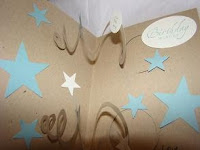
I wanted it to be fun when it opened so I created some spirals with my 1 3/4" circle and then I punched out large and small stars to decorate it with. I also used the School days stamp set in the mini and stamped 1st and then punched it out with a circle punch too (that's what the little circle in the upper middle is). I added some white and baja items over the whole inside of the card. The card goes lower, but I forgot to take a picture before I wrote my greeting on the bottom so I only took the upper portion in the picture. The saying near the top says Birthday wishes and is again punched with the wide oval punch. I like moving fun cards, so I enjoyed putting this together for him for his 1st Birthday.
So that is my share for the day. I hope you enjoy it and have a great day. Blessings.

Wednesday, July 7, 2010

Because I care in red/pink

Sorry I've been such a slacker posting. I have had to start teaching a weekly bible study group and that has been taking quite a bit of my extra time working on the study.
We are going through Philippians and we are only like on vs 19 of the first chapter in four weeks if that tells you anything. lol. It is good though and has been a great time as this class has all ages in it and it's been a great sharing and learning time. I just love getting to know all the ladies better. It just takes time making up and praying through all the lesson material. So between that, my family and making thank you cards and keeping up with club and my scrapbooking your faith class, I haven't had much free time lately it seems. So I'm sorry that I have less posts lately, but it has been for a good reason. :)

So since I've been on a roll making these thank you cards, I thought I would try different color combos. This one is Pretty in Pink and Rose Red for the flower. It again uses the Celery and olive for the leaves and Olive ribbon.
These have been really fun cards to make. Especially since I like to color. Now if I didn't like to color this would be a pain, but I do, so it's cool.
I have another sample I made for those of you that don't like to color and I'll show that soon, but this is one of the coloring ones.

So I hope you enjoy seeing this color scheme. There are just so many new cool things in the new catalog. I'm like a kid in a candy factory. So many choices and it's so hard to chose. :) If you haven't seen them yet, the new catalogs are great. We have 3 new ones. The regular Idea book and catalog, the new Decor elements line and the hispanic catalog. We also have the mini going on until August, so lots of fun things out there to chose from.
If you have any questions, let me know.
Have a great day today. Blessings.

Sunday, July 4, 2010

masculine july thank you

Since I've been trying to send out some thank you cards,
I wanted to send a thank you card to some men in our church that help out a lot. I don't have a lot of masculine sets, but I thought this one would be good for this month. This is the 4th of July set that is in the mini catalog. I used razzleberry, pacific point and daffodil as the colors on this card. The thank you is from the new level one set called Because I care. The star is popped up on dimensionals and I used the square punches to punch out the various pieces to make them all uniform. I've been using the notecards for convenience, which I'm really liking, so I ordered more. It all came together fairly quickly, which was great.
It's nice sometimes making quick and easy cards. I hope it encourages you to make some thank yous for some people too. there are just a lot of people we take for granted and sometimes it's nice just sending a note of thanks.
Have a great day today and God bless.